Native American Galleries
Indianapolis, IN, USA
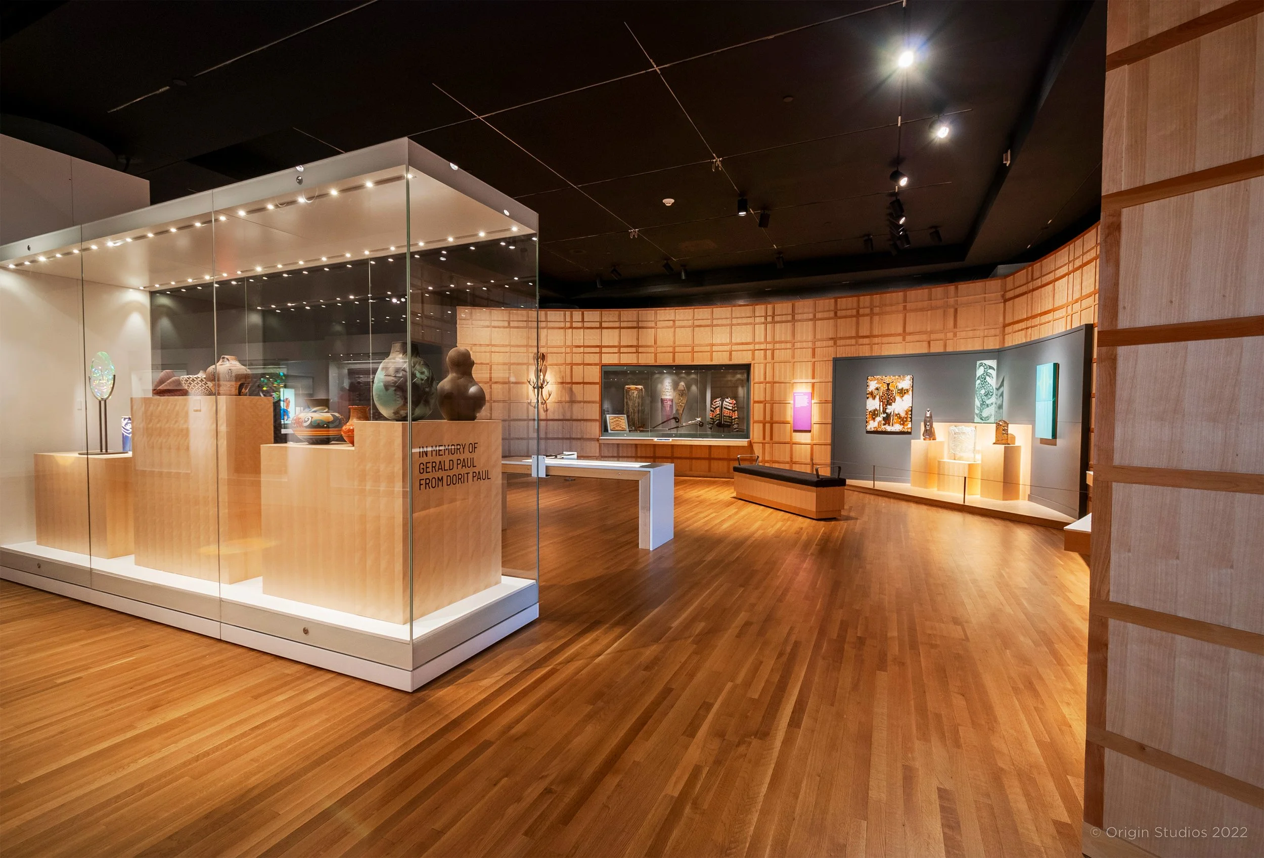
The Eiteljorg Museum launched an ambitious exhibition planning and design project in 2020 to reimagine the museum’s permanent Native North American gallery. Origin Studios won the bid to work alongside their dynamic and engaged in-house curatorial, education, and collection teams to turn the gallery into an energizing space focused on art that tells stories. The new gallery presents the rich, complex and vibrant artwork of Native North American Peoples.
As a design/build project, Origin Studios and its partner Kubik Maltbie, along with Click Netherfield and Richard Lewis Media Group (RLMG), and Indigenous Advisor Jeff Thomas, worked in collaboration with museum staff to deliver interpretation support, content management, storyline support, gallery media creation, exhibition and graphic design, fabrication and installation.
The gallery spaces have been thoughtfully designed to integrate Native American art from the Eiteljorg permanent collection that ranges from historical to customary to contemporary. This integration is a key aspect of the project and demonstrates continuous Native American cultural and artistic traditions. With a very specific decolonized approach, the objects are displayed in both unique environments and in critical-mass for better understanding of cross-cultural artistic sharing. Purpose-built case work, providing Category A museum best practice standards, allows for frequent rotation of objects and flexibility of display to tell the abundance of stories these artworks offer. Multi-perspective interpretation, from various voices, has been sympathetically woven throughout the design along with immersive environments that will encourage curiosity and participation through accessible interactive experiences. Visitors will come away understanding that Native peoples are still here, Native peoples are diverse, Native art and artistic practice are connected throughout time.
Eiteljorg Museum Website
Details
Eiteljorg Museum, Indianapolis, IN, USA
Opened June 25, 2022
Exhibit Space: 16,000 sq ft
Services
Exhibition, Graphic and Interactive Design
Content Management, Interpretation and Storyline support
Fabrication and Installation oversight
Jasper, Alberta
The Columbia Icefield located in the Sunwapta Valley in Alberta is no ordinary location for visitor experience planning! Origin Studios with their partner team at the Pursuit Banff Jasper Collection have embarked on a five-year site refresh of the Columbia Icefield Skywalk. We are enhancing the visitor experience by offering relevant and timely interpretive interventions at each of the six existing visitor stations along the walkway. Using placemaking as a foundation, visitors can explore the glacial and geological history of the icefield, the cultural importance the site holds for local Indigenous communities and visiting explorers, the plant and animal life of the area, as well as the feats of engineering that were required to build the glass-floored skywalk 280 metres above the ravine below.
Bringing an inclusive and accessible lens to the site’s offerings through universal design best practice; visitors will find up-to-date research, sharp graphic styling, meaningful interactives, and clever infographics. The strength of the annual refresh approach allows for maximum flexibility and the ability to quickly respond to site-specific opportunities and global discussions as they arise, all without an interruption in the exceptional visitor experience.
The Columbia Icefield is a fitting location in Canada to have authentic and honest conversations about the effects of climate change to the glacier, and it is with this placemaking focus that the team is embarking on real change at the site. By inviting visitors to reflect on the importance of the glacier while enjoying the incredible vista, the annual enhancements to the interpretive experience encourages them to keep the conversation going long after they return home.
Dawson City, Yukon Territory
Origin Studios won the competition to re-design the Dawson City Museum's permanent exhibition in 2015. In addition to completely revamping the gallery spaces, the Museum also wanted to change the exhibit narrative to expand its scope well beyond the late nineteenth-century Klondike Gold Rush. The most important aspect of this retelling of Dawson's history was including and acknowledging the centrality of the Tr’ondëk Hwëch'in First Nation in the local story.
Origin Studios worked with the museum staff to re-interpret their original chronological narrative into a series of thematic stories that were more relevant to the collection. Part of this process involved meeting with stakeholders in the region including representatives from the Tr’ondëk Hwëch'in, who have their own visitor centre exhibition where they tell their own story; however, the Tr’ondëk Hwëch'in story is an important part of Klondike Gold Rush and subsequent colonial settlement of Dawson City and we worked with them to ensure they were comfortable with the exhibition narrative and form.
The revamped exhibition designed by Origin Studios enables the museum to emphasize certain key objects and narratives that share the compelling stories of the Klondike and the people who have lived here.
Details
Dawson City Museum, Dawson City, Yukon Territory
Permanent Exhibition
Design Service from January 2016 to December 2016; Fabrication began in 2020
Exhibit Space: 8,700 sq. ft.
Services
Exhibition Design, Interpretive Support
City of Mississauga,
The Museums of Mississauga
Mississauga, ON
We Are Resilient is an outdoor travelling exhibition, collectively commissioned by the City of Mississauga and The Museums of Mississauga, to provide an immersive and engaging examination of the effects of climate change in the region. Mississauga, spread across 288 km, is Canada’s 6th largest city, and is one of the most diverse cities on the planet. It is also home to a comprehensive Climate Change Action Plan. The goal of the exhibiton is to foster interest and inspire collective action towards positive change for our environment and the climate.
The exhibition’s intention is to help residents discover the relevance of climate change in their daily lives and how it affects their community. Most importantly it highlights some of the ways the community can become more climate resilient. Indigenous voices and perspectives are woven into the exhibition to provide invaluable knowledge of the history of the Mississauga landscape and the effects that climate climate has had across the region. The history of the land is an important part of who Missisaugans are as a community. This exhibition deepens the learnings of environmental responsibility and sustainability.
Origin Studios was tasked with project management, research, writing, interpretive planning and exhibition design services. Sustainable and renewable processes and materials were a key component to the planning and production of this exhibition. Aluminum was chosen for the structures as it is 100% recyclable and can be recycled over and over without losing its inherent value. Fabric panels affixed to the structures provide the opportunity for re-use and to be reimagined as other products at the end of the exhibition. The design combines high-impact, compelling graphics with a variety of interpretive strategies to engage visitors and offer content on multiple levels for visitors of all ages to engage with.
Science, Indigenous knowledge, personal stories, and sustainable practices are woven together to look at the city’s environmental history, delve deeper into the social aspects of climate equity, and establish some impactful behavioural changes that will make for a much brighter future for everyone.
Details
City of Mississauga
Outdoor Travelling Exhibition
Opening July 2022
Exhibit space: 1,500 sq. ft.
Services
Project Management, Research,
Writing and Interpretive Planning
Exhibition and Graphic design
Halifax, Nova Scotia
The new Halifax Citadel Heritage Centre traces the histories of the site and the surrounding city from the pre-colonial period to the present through four versions of the iconic Citadel fortification. Situated at the top of a hill in the centre of the city with commanding views of the harbour and surrounding area, the Citadel has been a physical, visual, and cultural focus of the city for years. Starting with stories and commissioned artworks from the local Mi’kmaq Indigenous people, visitors move through the different historical periods associated with each physical iteration of the Citadel until they arrive at the current stone star-shaped structure.
Immersive environments, like an eighteenth-century blockhouse, and state of the art digital interactive object recognition tables, provide a range of experiences for all types of visitors. Original, commissioned Mi’kmaq art and reproductions of historical images ranging, from the drawings by British military officers to more recent photojournalism, are plentiful through the graphics, while interactive story stations provide “live” first-person testimonials from each historic period. There is something here to appeal to everyone.
https://www.pc.gc.ca/en/lhn-nhs/ns/halifax
Details
Halifax Citadel, Halifax, Nova Scotia
2022
Exhibit Space: 6,300 sq. ft.
Services
Exhibition, Graphic, and Interactive Design
Press
“Halifax Citadel Ready To Open New Signature Exhibit,” National Parks Traveler (May 3, 2022)
Calgary, Alberta
The directive for this project was to use the basic principles of museum learning and best practices to create a corporate gallery that would offer visitors a sense of the rich cultural history of the firm. The corporation is a family-owned, leader in the Canadian technology landscape. Their intention for the ground-floor, corporate headquarters space was to build a visitor centre for employees, corporate guests and site visitors that offers insight into the history of the company, its importance to the local community, the key players involved, and the legacy they have established in this particular sector.
Origin Studios structured the exhibition into two main sections joined by a passage featuring an interactive touch-wall timeline. This interpretive approach offers thematic sections, storylines and objects that are essential to understanding this unique brand. Content in each theme, such as “Community” and “Technology,” is grouped by type, relevance, or even aesthetics, the sequencing of dates and events is reserved for the timeline. In addition to the full wall digital interactive timeline, the exhibition includes a data visualization station where raw corporate data is turned into stunning interactive displays.
Large interactive touch screen walls, an immersive theatre (which is available for special event screenings), and an interactive digital sculpture are contextualized by more traditional graphic panels and artifact displays drawing material ranging from the family’s personal stories to data sets comprising fibre optic network traffic and corporate acquisitions. A bank of small touch screens in the back of the exhibition provides an intimate and personal space where visitors can browse curated collections of images, texts, and videos from the corporate archives.
Details
Corporate Visitor Centre, Calgary, Alberta
2020
Ongoing Permanent Exhibition
Exhibit Space: 3,200 sq. ft.
(Please note that the client has agreed to let us share images of this exciting project but has asked not to be identified)
Services
Content Development and Management
Exhibit, Graphic and Interactive Design from Concept to Final Design
Sheikh Faisal Bin Qassim Al Thani Museum, Qatar
The travelling exhibition Coffee for Two, curated by the Sheikh Faisal Bin Qassim Al Thani Museum in Doha, Qatar, and destined for various cities throughout the US and Qatar, explores the cultural aspects of coffee, the world’s most social beverage. From traditional Arabic coffee (Qahwa) to Starbucks in the USA, coffee is far more than a beverage. It is an invitation to life in the form of a cup of warm liquid. Coffee is an experience, an offer, and has been a domestic and public ritual since time immemorial. In celebration of the Qatar/USA Year of Cultural Exchange, coffee is celebrated as the bridge that unites people across all cultures.
Origin Studios and partner Holman Exhibits, as a design-build team, worked entirely remotely from their offices in Canada throughout 2020/2021 to create this sustainably planned travelling exhibition that offers a sumptuous, immersive experience. The objects from the Museum’s collection illustrate the traditional Arabic preparation of coffee and are paired with a traditional Arabic Majlis, where coffee would be enjoyed with friends and colleagues. As a result of pandemic restrictions, the majlis was designed to allow for social distancing while also being warm and inviting. The exhibition offers opportunities for in-person and virtual programming such as “A Coffee With” conversation series with public figures and will travel through to 2023.
Sheikh Faisal Bin Qassim Al Thani Museum Website
Details
Sheikh Faisal Bin Qassim Al Thani Museum, Qatar
Travelling Exhibition
Inaugural Exhibition opening 2022
Exhibit Space: 1,000 sq. ft.
Services
Exhibition Design, Interpretive Planning, Graphic and Custom Illustration
The Soil Superheroes travelling exhibition provides visitors with an underground perspective on the importance of soil science and conservation. Visitors are introduced to the star players — such as Captain Clay, The Mole, and Wonder Worm — and learn how their superpowers not only provide humans with food and medicine, but also clean the water we drink and protect our climate! Through playful imagery, interactive activities, and a colourful storyline, these small-but-mighty characters help us answer the questions, “What is soil, anyway? Why is it so important?” Developed by the Canada Agriculture and Food Museum, this interactive exhibition makes the difference between healthy and unhealthy soil much clearer than mud! Origin Studios and Kubik Maltbie were tasked with creating a modular travelling exhibition that engaged multi-generational visitors using charming graphics and hands-on activities. The exhibit needed to have a high-impact plan at the inaugural installation at Ingenium, while allowing for maximum flexibility for future installations where gallery spaces were non-traditional. We designed a central activity hub where ideas were connected to freestanding wall panels through interpretive text and illustrated avatars. To achieve the experience the client was seeking, we mixed hard form exhibitry with textile wall systems and modular elements. This approach also models sustainability as it needed fewer crates.
Details
Ingenium: Canadian Agriculture and Food Museum
2021
Travelling Exhibition
Exhibit Space: 1,000 sq. ft.
Services
Exhibit and Interactive Design
St. Francis Xavier University, Antigonish, Nova Scotia
The new 94,000 square foot Mulroney Hall at St. Francis Xavier University provides modern learning and flexible spaces for the campus and houses the new Mulroney Institute of Government. To recognize and honour both Brian Mulroney’s contributions to our nation and to his alma mater, Mulroney Hall includes an exhibition focusing on Mr. Mulroney’s formative years as an undergraduate student at St. FX and his career as Canada’s eighteenth Prime Minister (1984-1993). Visitors will come away from the exhibition with knowledge of Mr. Mulroney’s political achievements, an understanding of the position of prime minister of Canada as a nexus of leadership, governing, and public service, and the role that St. FX played in Mr. Mulroney’s path to becoming Prime Minister. It is the closest thing Canada has to a Presidential Library.
The exhibition includes a mix of traditional and technological installations. The Chamber is a large-scale media interactive that allows visitors to select from Mr. Mulroney’s best speeches and mini documentaries based on exhibit themes. Interactive digital labels enable visitors to delve deep into the stories of artifacts throughout the exhibition. On the other end of the spectrum, a full-scale immersive reproduction of the oak panelled Prime Minister’s Office transports visitors back to the 1980s with period furnishings, including Mr. Mulroney’s actual desk.
Distributed over four floors, each space is dedicated to different themes and stories of the Prime Minister’s career based on the use of that part of the building. Mr. Mulroney the St. FX alumnus is on the first floor next to the Ron Joyce Forum, the main student gathering area in the building. The exhibits on the third and fourth floors reflect the academic offices in those areas. And the second floor is dominated by the re-creation of the Prime Minister’s Office and the “exhibit pods” along Scholar’s Walk, the main east-west axis in the building. Each space immerses visitors in different stories, objects and images, interactives, and experiences.
Origin Studios provided complete exhibition development and design services for the exhibition. In addition to producing an interpretive plan, developing stories, selecting artifacts and images, and writing text, we also created and catalogued the Mulroney Collection for the university, bringing together artifacts and political ephemera from diverse sources. The design team worked closely with our fabrication and media partners to bring the exhibit to life, including the Prime Minister’s Office re-creation, which, according to Mr. Mulroney “is exactly the way it was.”
Details
St. Francis Xavier University, Antigonish, Nova Scotia
2019
Exhibit Space: distributed in dedicated spaces within 94,000 sq. ft. building
Services
Interpretive Planning, Content Development, and Exhibit Design
Press
Sharon Kirkey, “’This is exactly the way it was’: Replica of former PM’s office a highlight of new Mulroney Hall,” National Post (Sept. 17, 2019).
https://nationalpost.com/news/this-is-exactly-the-way-it-was-replica-of-former-pms-office-a-highlight-of-new-mulroney-hall
Laura Stone, “$100-million Brian Mulroney Institute of Government opens at former prime minister’s alma mater St. Francis Xavier,” The Globe and Mail (Sept. 18, 2019).
https://www.theglobeandmail.com/canada/article-100-million-brian-mulroney-institute-of-government-opens-at-former/
Corey LeBlanc, “St. F.X. celebrates grand opening of Mulroney Hall in Antigonish,” The Chronicle Herald (Sept. 18, 2019).
https://www.thechronicleherald.ca/news/provincial/st-fx-celebrates-grand-opening-of-mulroney-hall-in-antigonish-353998/
“STFX celebrates grand opening of the Brian Mulroney Institute of Government and Mulroney Hall,” St. Francis Xavier University (Sept. 18, 2019).
https://www.stfx.ca/about/news/Mulroney-Hall-Grand-Opening
Roche Canada
Mississauga, Ontario
Roche Canada is both a pioneer and a trusted leader in pharmaceutical clinical trials. Their research into rare medical disorders and personalized healthcare has resulted in a unique corporate culture that has nurtured passionate staff while cultivating relationships with a focussed client base. As an organization they understand the potential of using technology to enable learning and often seize the teachable moment to make science more accessible to visitors, staff, and patients.
As a result of seeking to share their scientific breakthroughs and the powerful, first-person stories of the grateful patients and families who are affected by their work, Roche asked the Origin Studios/kubik maltbie/NGX team to provide turnkey services for a site-specific project that would transform their multi-storey atrium into an immersive, meaningful, art experience. Using the principles of museum design thinking, the team was able to disrupt the atrium of the Roche headquarters to provide visitors and staff with dynamic and captivating educational experiences in a space that encourages wonder.
With a focus on the fascination we all have for human DNA, the team chose to launch from that universal concept and integrate industrial, graphic, and multimedia design strategies throughout the atrium allowing users to explore content through accessible, interactive modules targeted to meet the diverse learning styles and needs of the visitors. The Origin and kubik teams worked extensively with the Roche facility and structural engineers to understand the opportunities and limitations of the building and were able to achieve a soaring installation that integrates harmoniously with the surroundings while being both expansive and intimate. The centralized structure acts as a perimeter around and under which the learning experiences are localized. From dynamic large-format, crowd sourced projections to single-user exploration kiosks, NGX harnessed the most suitable hardware to exceed expectations on accessibility, experience, and long-term viability.
Our team’s overall interpretive strategy embraced Roche’s intention to connect with their staff and clients through their clear set of corporate priorities: focus on patients, excellence in science, access to healthcare, and sustainable value. The Origin Studios/kubik maltbie/NGX team achieved this by weaving them into the written content, design elements, and interactive stations to optimize engagement and to promote expected learning outcomes.
Details
Roche Canada, Mississauga, Ontario
2020
Continuing as permanent display
Exhibit Space: 1,400 sq. ft.
Services
Interpretive Planning, Content Development, Exhibit Design and Media Design
Cavendish, Prince Edward Island
Green Gables, the home of Lucy Maud Montgomery’s fictional character Anne Shirley, is an international tourist destination in Prince Edward Island, Canada’s smallest province. The new Green Gables Heritage Place was built to modernize the offerings on the site of this famous home, including an exhibition that appeals to visitors of all ages from around the globe. Interpreting Montgomery’s vivid imagination through modern design details, family friendly interactives, and compelling historical and contemporary stories, the new facility provides a one-stop resource for visitors who want to tour the site and learn more about the author, the character, and the setting.
https://www.pc.gc.ca/en/lhn-nhs/pe/greengables
Details
Park Canada, Green Gables Heritage Place, Cavendish, Prince Edward Island
2019
Exhibit Space: 4,700 sq. ft. plus outdoor interpretation
Services
Exhibit Design
Press
Halifax, Nova Scotia
The new Canadian Museum of Immigration at Pier 21 tells the stories of Canada's immigrants and the history of Pier 21 as an important gateway to this nation. From the time of the first European traders and settlers to the waves of immigrants in the nineteenth and twentieth centuries, immigration has had a profound effect on Canada. The Museum’s mandate, to foster public understanding of the experience of immigrants and to highlight the contributions they have made to our ever evolving culture, economy, and way of life, is brought to life on the exhibition floors in two galleries: the Pier 21 Gallery and the Canadian Immigration Gallery.
The Pier 21 Gallery tells the stories of the one million immigrants who came through this marine gateway to Canada from 1928 to 1971, and the people who worked and volunteered at Pier 21. This exhibition space incorporates the historical Pier 21 building and Origin Studios used the wood and painted steel present in the interior as part of our design language. The Canadian Immigration Gallery is a vibrant new exhibit space and in addition to telling important stories and histories through artifacts and graphics, visitors can access the Museum's oral history collection through a number of interactive story stations.
Both exhibitions foreground the first person voices of new and old Canadians through the Canadian Museum of Immigration's rich oral history collection, giving visitors a snapshot of the people who have contributed to the richness and diversity of Canada.
Awards
This exhibit won Gold for Best Museum Environment in the Event Marketer Experience Design Awards, 2015.
Details
Canadian Museum of Immigration at Pier 21, Halifax, NS, 2015
Exhibit Design
Exhibit Space: 18,000 square feet
Press
“Canadian Museum of Immigration Reopens Following Expansion,” CTV News Atlantic (25 June 2015)
“Halifax’s Pier 21 Museum Officially Reopens to the Public,” CBC News (23 June 2015)
Eric Pellerin, “Design-Driven Canadian Museums to Visit When They Re-open,” RGD (2 March 2021)
The Military Museums, Calgary, Alberta
The Military Museums of Calgary, Alberta form the largest tri-service museum in Western Canada whose collection and programming offers insight into the history of Canada’s Armed Forces – the Army, Navy and Air Force. The collection of five regimental museums provide programming, research and education into the history, heritage, and art related to the Canadian Armed Forces.
The Military Museums of Calgary in association with the Canadian Armed Forces Directorate of History and Heritage developed the travelling exhibition Mission Afghanistan which explores Canada’s military and civilian involvement in Afghanistan throughout the war. The exhibition displays artifacts gathered in Afghanistan by the Directorate and features video interviews with soldiers, civilians, and politicians who were part of the Canadian mission. The multiple voices and perspectives contribute to an exhibition narrative that transcends the political and official histories to tell stories that are evocative and personal.
The Canadian Armed Forces deployment to Afghanistan in response to the 9/11 terrorist attacks in the United States was our nation’s longest war, lasting from 2001 to 2011, and its first significant combat mission since the Korean War in the 1950s. Visitors are immersed in a high-impact introductory hallway focusing on 9/11 which leads to a theatre-in-the-round space which contextualizes the conflict, the role of the Canadian Armed Forces, and the contributions of other Canadian institutions who were involved in nation building.
As this is a travelling exhibition whose host locations will have variable display space and resources, the exhibitry is modular and flexible allowing it to be installed in multiple formations.
Details
The Military Museums, Calgary, Alberta
2020
Travelling Exhibition
Exhibit Space: 2,000 sq. ft.
Services
Interpretive Planning, Content Creation, Content Management and Exhibit Design
Press
Rob Alexander, “REMEMBRANCE DAY: Exhibit recognizes Afghanistan mission,” RMOTODAY (Nov. 11, 2021)
Beaumont-Hamel & the Trail of the Caribou,
Royal Newfoundland Regiment Gallery
St. John’s, Newfoundland
When the First World War broke out in Europe in the late summer of 1914, the small dominion of Newfoundland responded by raising its own regiment to send overseas, the venerable “First 500.” The Newfoundland Regiment, which initially saw action in Gallipoli, was decimated at the Battle of Beaumont-Hamel, part of the Somme Offensive, on July 1, 1916. Of the more than 700 men who went “over the top” that morning, only 68 answered roll call the following day. July 1 has become an important day for the people of Newfoundland and Labrador to remember and reflect on the sacrifices of those young men and all those who came after them.
The Royal Newfoundland Regiment Gallery’s exhibition not only tells the story of this tragic battle and the Regiment, but also the stories of the men and women who were instrumental on the home front and in non-combat roles overseas. It is both a personal and comprehensive look at Newfoundland during the First World War and the symbols and stories from this period that still inform the identity and landscape of Newfoundlanders and Labradorians.
Origin Studios and fabrication partner Holman Exhibits created a space that accommodates both the personal and political stories of Newfoundlanders and Labradorians while also conveying the sacrifices of the Royal Newfoundland Regiment. Materials and colour palettes for the exhibition were drawn from the materials of the day, including the wool uniforms, wood and steel structures, and colours from military and civilian uniforms and badges. The innovative modular graphic panel design will allow The Rooms to update and switch out panels in the future as new stories and artifacts are brought to the museum by the families of First World War participants, keeping the stories alive and ever changing.
The exhibition opened at The Rooms on July 1st, 2016, the 100th anniversary of the Battle of Beaumont-Hamel.
Details
The Rooms Museum, St. John’s, NL, 2016
Exhibit Design
Exhibit Space: 6,500 square feet
Extras
A three-dimensional virtual walkthrough of the exhibit is available on The Rooms' Great War Exhibit website, which Origin Studios designed. To experience the tour, please go to:
Honours
Beaumont-Hamel and the Trail of the Caribou was one of two finalists for the Governor General's History Award for Excellence in Museums: The History Alive! Award for 2017.
Press
The Husky Energy Gallery (From This Place) and The Elinor Gill Ratcliffe Gallery (Here, We Made a Home)
The Rooms, Newfoundland and Labrador’s premier cultural institution encompasses its Provincial Archives, Art Gallery and Museum. This innovative centre shares the province’s rich cultural identity with local, national, and international audiences. In 2011, Origin Studios won an international competition to collaborate with The Rooms curatorial team in the development of a new permanent exhibition about the peoples of Newfoundland and Labrador, from the late 1700s to present day.
This complex project explores the lives and cultures of the Innu, Inuit, Mi’kmaq and the people of NunatuKavut, as well as descendants of European settlers. In addition to presenting stories of place and history, the mezzanine level exhibition explores significant events, individuals and traditions that have shaped this fascinating part of the world. The exhibit environment uses the plank building style of local architecture, in an attempt to capture the texture and nuance of the province. The effect is rugged, welcoming, colourful and unpretentious, much like the people of the region.
Awards
This exhibit received the 2014 Canadian Museums Association’s Award of Outstanding Achievement in Exhibitions.
Details
The Rooms, Provincial Museum and Culture Space,
St. John’s, Newfoundland
2013
Exhibit Space: 9,500 sq. ft.
Services
Interpretive Planning and Exhibit Design
AGA KHAN MUSEUM, TORONTO
The exhibition Marvellous Creatures: Animals in Islamic Art at the Aga Khan Museum focussed on the real and mythical animals that feature in the legends, tales, and fables of the Islamic world, divided into the natural quadrants of earth, air, fire, and water. Through a variety of objects and artworks – including manuscripts, textiles, ceramics, jewellery, glass, and metalwork from the seventh to the twenty first centuries – the exhibition Marvellous Creatures celebrates these real and mythical animals and illuminates the knowledge contained in their stories.
The concept and inaugural object list for Marvellous Creatures was borrowed from the Museum of Islamic Art, Doha, Qatar, and was augmented with works from the Aga Khan Museum collection and other collections which meant that much of the content and all of the exhibitry for the exhibition had to be redesigned and customized for the Museum’s gallery space. Origin Studios worked with the Museum to create a unique floor plan, design new display cases, new graphics, and new interpretive panels for this colourful and fantastical exhibit. For the overall design look and feel, Origin worked with colours, designs, and animals found in the artworks in the exhibition. Large format reproductions of animals, contrasting warm and cool colour palettes, and intentional architectural arrangements created an immersive and rich environment for the spectacular artifacts.
Origin Studios worked with the staff of the Aga Khan Museum from schematic design to final design and into installation to ensure that design intent was carried through to the final production. The temporary exhibition was on display at the Aga Khan Museum from May to September 2016.
Details
Aga Khan Museum, Toronto, Ontario 2016
Exhibit Space: 5,000 sq. ft.
Services
Exhibit Design and Fabrication Supervision
Press
Karen von Hahn, “Marvellous creatures at the Aga Khan,” Toronto Star (May 27, 2016)
Renaissance ROM
Origin Studios worked with the Royal Ontario Museum in Toronto, to complete exhibit design and development for the RenaissanceROM project. Our involvement began with interpretive planning and conceptual development, and ended with detailed design.
The design language and communication strategy developed for this project was intended to serve as a bridge between the Royal Ontario Museum’s renovated heritage galleries and the new galleries located in the Libeskind-designed expansion. Our approach was to reverently emphasize the artifacts themselves, placing them at centre stage, unencumbered by lengthy interpretation or encroaching design elements. This elegant solution is both sensitive and deliberate, allowing even the most minute detail to be appreciated. The presentation style highlights the tactile and visual qualities of each object, striking a powerful balance between the didactic and aesthetic experience.
The Origin Studios team worked in collaboration with project leaders Haley Sharpe Design (Leicester, UK), as well as curatorial and conservation staff, to develop ethnographic, decorative arts and natural history displays. This project presented some exciting challenges. The physical structures that emerged from our process are versatile enough to support everything from a massive dinosaur or woolly mammoth to the tiniest Chinese carving—while the visual language is powerful enough to effectively bridge the contemporary Libeskind addition and the original 19th-century building. These significant exhibits speak to the museum’s varied audiences by fusing academic integrity, contemporary design, entertainment, and education.
Details
Royal Ontario Museum, Toronto, ON
2002 – 2006
Exhibit Space: 175,000 sq. ft.
Services
Interpretive Planning, Conceptual Development, Exhibit Design
Permanent Exhibitions
Ottawa, Ontario
Origin Studios co-led the permanent exhibition design for the Canadian War Museum, creating immersive and compelling exhibits about the military events that shaped this country’s history. Themes range from the prehistoric to the contemporary, involving intense and beautiful narratives from both home and abroad. The approach to story telling is layered and often dense, in order to ensure the weighty subject matter is accessibly conveyed. In this elaborate and complex exhibit hall, artifacts range from the massive to the delicate—from intimidating military vehicles, to precious medals and fragile archival documents. In designing the spaces we introduced a deliberate interplay between the graphic panels and the building architecture. The result is a thoughtfully composed, cohesive series of exhibitions where shape and structure influences the visitor experience. While some of the exhibit spaces are inviting, comfortable and harmonious—others are tense, combative and uncomfortable.
The museum and its displays serve as a tribute to all who’ve fought for our freedom, as such we felt it imperative to share as many stories as the walls could hold. The challenge and triumph came in doing so respectfully, without compromising the intensely personal and emotional aspects within. As a result, the design plan accommodates multiple levels of information carefully arranged in thoughtful hierarchy. The exhibitions boast well over two kilometres of graphics, 2000 photographs and more than 250,000 words—a visual celebration, and undoubtedly our most complex exhibit project to date.
Details
Canadian War Museum, Ottawa, ON
2001 – 2005
Exhibit Space: 76,000 sq. ft.
Services
Exhibit Design
The Lost Dhow: A Discovery from the Maritime Silk Route
Toronto, Ontario
The Lost Dhow exhibit is based on the cargo recovered from a wrecked ninth-century Arab trading ship discovered off the coast of Belitung Island, Indonesia, in 1998. The exhibit, jointly organized by the Asian Civilisations Museum of Singapore, the Singapore Tourism Board, and the Aga Khan Museum, documents this remarkable archaeological find and sea-based trade between the Tang Empire and the Abbasid Empire, which together influenced an area stretching from the East China Sea to North Africa. The Lost Dhow gives us an important glimpse into the quantity and quality of the goods traded on the Maritime Silk Route and the cosmopolitan nature of the crews and traders in the ninth century long before the first western European ships dropped anchor in China.
The task for Origin Studios was twofold: to design an exhibition that would inform visitors about the ninth-century cargo ship and its discovery in the twentieth century, and also to create a space to display the commercial cargo and showcase the treasures. Origin created a central entranceway based on the size and shape of the dhow outlined on the floor. This feature is flanked by graphic banners holding historical and contextual information about the ship and its discovery and led visitors to the most valuable and important artifacts – the treasures – of the exhibition. From the treasures, visitors could explore hundreds of pieces of Tang Dynasty ceramics that made up the bulk of the cargo. The end result was an exhibit that emphasized the wonder and resonance of beautiful objects while also providing the deep historical and material context that gives them meaning.
Origin Studios worked with the staff of the Aga Khan Museum and guest curator John Vollmer from schematic design to final design and oversaw installation by the fabricator Holman Exhibits. The temporary exhibition is 5,000 square feet and opened at the Aga Khan Museum, Toronto, in December 2014.
Details
Aga Khan Museum, Toronto, ON
2014
Exhibit Space: 5,000 sq. ft.
Services
Exhibit Design, Installation oversight
Press
James Adams, "The Lost Dhow: Aga Khan Exhibit Showcases Links Between Ancient Islam and China," The Globe and Mail (12 Dec. 2014), available at globeandmail.com.
All photographs by Janet Kimber. © The Aga Khan Museum, 2015.
The Pleasures and Perils of Dress
in the 19th Century
Bata Shoe Museum, Toronto, ON
Fashion Victims explores two sides of nineteenth-century fashion: the beautiful clothing and shoes worn by the fashionable men and women of the period and the processes and chemicals that made those same fashions potentially deadly. Toxic dyes – most famously arsenic green – and processing chemicals, as well as difficult working conditions, were the unseen story of nineteenth-century dress. This exhibition includes François Pinet’s opulently embroidered and labour intensive footwear, beaver felt top hats processed with mercury, and Empress Elisabeth of Austria’s extraordinarily narrow and constricting boots and gloves. Each object illustrates the exhibition's central thesis that fashion could be a dangerous business both to make and to wear.
Origin designed the exhibition using visual contrasting spaces to illustrate the dual nature of nineteenth-century fashion. The public face is warm and inviting, slightly luxurious, and invokes the era through the repetition of distinctive decorative forms and visual culture. The production story, on the other hand, is presented through stark and restrained exhibitry, physically separate from the luxurious presentation of public fashion, and includes the tools of the trades as well as relatively unglamorous worker’s shoes.
Origin Studios worked with the Bata Shoe Museum’s curatorial staff through the entire project, from schematic design to final design, and provided final drawings to the exhibition fabricator. The 3,200 square feet temporary exhibition opened at the Bata Shoe Museum, Toronto, in June 2014.
Details
The Bata Shoe Museum, Toronto, ON, 2014
Exhibit Design
Exhibit Space: 3,200 sq. ft.
Press
Anne Kingston, "Deadly Victorian Fashions," Maclean's (9 June 2014), available at macleans.ca.
Nichole Jankowski, "Toxic Dyes and Mercury-Laced Hats: Exhibit Looks at the Dark Side of Fashion," The Globe and Mail (11 June 2014), available at globeandmail.com.
Karen von Hahn, "Bata Museum Exhibition Shows Pleasures and Peril of Fashion," Toronto Star (18 June 2014), available at thestar.com.
Bird and Mammal Galleries
The Canadian Museum of Nature in Ottawa undertook a major renovation of its historic building from 2004 to 2010. This resulted in new galleries and exhibition spaces within the significant heritage landmark. Origin Studios designed and developed exhibits for the Birds of Canada and Mammals of Canada galleries, two of the museum’s signature spaces that were in need of significant updating. We were part of a collaborative effort, working to incorporate refurbished specimens and dioramas into updated environments, with new graphics and content. Our role involved the main display area of the Birds gallery, as well as children’s areas and interactives for both the Bird and Mammal galleries. The scope also included illustration and computer animation work.
Though traditional in its approach to specimen presentation, there is nothing musty or predictable about the Bird Gallery design. Where one might expect a cluttered, wooden science hall, we steered our design in the opposite direction. Open, airy and spacious, our avian exhibit provides plenty of room for the specimens to soar. The gallery is bright and white, providing a perfect backdrop for the stunning birds and their brilliant plumage. Clean-lined, custom-built casework unobtrusively houses the extensive collection, while contributing to the overall effect of contemporary elegance.
Details
Canadian Museum of Nature, Ottawa, ON, 2006
Exhibit Space: 6,000 sq. ft.
Services
Exhibit Design
Bruce D. Campbell Farm & Food Discovery Centre
Origin Studios led the development of this new Discovery Centre, which opened in 2011-2012. We created the centre’s master plan, designed all exhibit spaces, interactives and graphics, and supervised final installation. In this instance, our interior design and spatial layout also influenced the architecture of the building. The centre is themed around environmental responsibility and food safety, and the four main sections include: crop management; meat production; the food processing cycle; and an examination of food choices, healthy eating, and food safety. An extensive series of interactives—both manual and digital—effectively support the key messaging throughout.
This project was produced for the Department of Agriculture at The University of Manitoba, and is located on an experimental farm where pigs and cattle are raised. The site is dedicated to sustainable farming practices, and employs methodology derived from the 1800s to create favourable conditions for the livestock, while managing odours in a visitor-friendly way!
Details
University of Manitoba, Winnipeg, MB, 2012
Exhibit Design & Branding
Exhibit Space: 9,500 sq. ft.
On a Pedestal: From Renaissance Chopines to Baroque Heels
On a Pedestal, installed in the third floor gallery at the Bata Shoe Museum, was a 3500 square foot show that brought together extraordinary shoes and extreme fashions of the Venetian Renaissance. Display elements included rare examples of Renaissance and Baroque footwear on loan from numerous renowned museums, including: Victoria and Albert Museum (London), Museo Bardini (Florence), Castello Sforzesco (Milan), Livrustkammaren and Skoklosters Slott (Stockholm), Museo Palazzo Mocenigo and Museo Correr (Venice), Ambras Castle (Austria), Boston Museum of Fine Art (Boston), and Royal Ontario Museum (Toronto), as well as shoes from the museum’s own collection.
The primary design challenge was to find a tasteful way to create an immersive, 16th century, period-like environment. In order to achieve this we began with a custom wallpaper design, inspired by the palate and motifs of the day. We then added organizational structure to the interior using purchased columns, combined with ornate, custom-built arches and profiles. The overall effect was one of intimate spaces, carefully crafted to highlight the richness of the displays. The design was influenced by Venetian courtyards, which aligned with the client’s vision of the era. Our project scope included the exhibition catalogue, as well as marketing materials. Our poster design featured a fantastic, column-like shoe, connecting the collection to the architecture within the space—and a typographic window, offering a glimpse into the decadent materials on display.
Details
Bata Shoe Museum, Toronto, ON, 2009
Exhibit Design
Exhibit Space: 3,200 sq. ft.
The Roaring Twenties: Heels, Hemlines and High Spirits
Origin Studios worked closely with the Bata Shoe Museum to develop this environment formed almost entirely by graphical interpretations of 1920s architectural details. The Roaring Twenties was a 2500 square foot exhibition, exploring the relationship between 1920s fashion and its myriad of influences, from cinema and jazz, to art and architecture. Here the conservative project budget demanded creative problem solving. Our solution was to rely on high impact, two-dimensional design elements. We created the exhibit environment using exquisite details extracted from Art Deco buildings in Montreal and New York, including an iconic starburst pattern taken directly from the Empire State building. We introduced a neutral palette to complement the show stopping Louis Vuitton shoe trunk in the centre of the exhibit, and to highlight the warmth of the collection. The graphic approach allowed design elements of the era to play a dramatic role, while ensuring the shoes themselves remained the focus. The promotional materials effectively combined the key components of the era, using the starburst to dramatically highlight the star of the show, the footwear!
Details
Bata Shoe Museum, Toronto, ON, 2011
Exhibit Design
Exhibit Space: 2,700 sq. ft.
Emergence from the Shadow
From sports logos to toys, to the Hollywood Western, popular culture has played a major role in creating and establishing stereotypes of the North American Indian. Through the lenses of historical anthropology and contemporary Aboriginal photography, Emergence from the Shadow looked at past and current perspectives on First Peoples, examining themes of community and continuity.
This exhibit, rich with metaphor and meaning, used shadow and light as major themes throughout. Projected images were used to suggest the ghost-like presence of ancestors, and to infer that images on film could never fully communicate the light or life of an individual. Shadows cast by the photographs themselves made reference to the souls of the subjects.
Works by aboriginal artists were placed opposite displays about the anthropologists who had studied their cultures, allowing the object to become the author. Anthropological photos were left unframed, sandwiched between plexiglass panels and raised from the wall like specimens, so that visitors might understand them as scientific in nature, rather than artistic. The influence of the ancestors was felt strongly in each work of art, as were themes of identity, archetype and stereotype. The exhibit posed questions and created juxtapositions between generations, allowing visitors to conclude that we are indeed more alike than different from those who came before.
Details
Canadian Museum of Civilization [Canadian Museum of History], Gatineau, QC, 1999
Exhibit Design
Exhibit Space: 7,000 sq. ft.
Watched by Heaven, Tied to Earth
Origin Studios created Watched by Heaven, Tied to Earth at the Bata Shoe Museum, completing the exhibition design, interior space planning, furniture and cabinetry design, graphic design, artifact placement, and design styling. The show exhibits a collection of Chinese children’s footwear and garments from the museum’s permanent collection, as well as some on loan from a private collection. Common among many of the shoe designs are animal talismans, intended to summon protection. These ornate elements provided a powerful basis for our design inspiration.
Collaborating with the curator and cultural consultants, our designers developed graphics and textures from an array of traditions within Chinese history. The resulting, rich and distinctive visual language honoured Daoism, traditional garden design, feng shui, Buddhism, the Chinese animal zodiac, and Chinese vernacular design and architecture. The look and feel of the exhibition effectively combined the mysticism of the Chinese spiritual tradition with the festivity characteristic of the culture’s celebrations.
Awards
This exhibit won a prestigious Design Exchange award in 2006 in the category of Interiors Design: Temporary or Portable.
Details
Bata Shoe Museum, Toronto, ON, 2006
Exhibit Design
Exhibit Space: 3,200 sq. ft.
Men’s Fashion: Clothes Make the Man
Clothes Make the Man explored how men’s clothing has long been shaped by vanity, practicality and the ever-elusive masculine ideal. This major exhibition explored the transformation of men’s clothing production—from homemade, to handmade, to ready-made—and examined 300 years of traditions and trends.
As we grew to appreciate the stories of the fashions, we became intrigued by the idea of bringing each piece of clothing to life. Rejecting the static quality of traditional museum mannequins, we elected to work with a theatrical designer to transform the vignettes from display to performance. The result was elegant and theatrical—the clothes floating while filled with form and life.
Exquisite details were magnified and used as backgrounds for the displays, encouraging the visitor to look more closely at the artifacts before them. Because the client did not want to use glass cases, it was essential to protect the collection by distancing the audience from the clothing. We developed layered graphic panels to establish an integrated and inconspicuous barrier, enhancing, rather than detracting from the objects. Contextual labels and interpretive texts were placed below the artifacts, so as to respectfully preserve sight lines.
We displayed clothing of opposing styles and purposes in close proximity to create dramatic juxtaposition. Smaller, more fragile objects were placed in the foreground, making them easier to view and allowing for protection and climate control. Accessories were placed in and around associated clothing to ensure proper context. While our lighting options were limited due to conservational requirements, we enlivened the displays with rich colours and textures drawn from the objects themselves.
Awards
Clothes Make the Man received the Costume Society of America’s 2003 “Richard Martin Award for Excellence in the Exhibition of Costume”.
Details
McCord Museum of Canadian History, Montreal, QC, 2002
Exhibit Design
Exhibit Space: 6,000 sq. ft.
Canada’s Historic Places Website Design
Origin Studios developed this complex, database-driven website for Canada’s Historic Places collaborative initiative: an exhaustive centralized repository allowing access to 12,500 historic sites as well as associated images, documents and resources. The project was intended to feature as many photographs as possible from the vast combined collection. Guidelines required it be a searchable HTML site, drawing content from a Content Management Database developed by Parks Canada.
Visit the website at www.historicplaces.ca
Details
Parks Canada, Ottawa, ON, 2010
Website Design
Afghanistan: A Glimpse of War
Afghanistan: A Glimpse of War, is a ground-breaking exhibition about Canada’s participation in the international security mission, with content comprised of photographic and video records captured by journalists Stephen Thorne and Garth Pritchard. The exhibit focuses on the personal experiences of Canadian military personnel, and the Afghanis with whom their efforts intersect. The exhibition also profiles the current conflict in Afghanistan—from the events of September 11, 2001, to the deployment of Canadian troops, and ongoing operations.
Details
Canadian War Museum, Ottawa, ON, 2007
Exhibit Design
Exhibit Space: 3,500 sq. ft.
Statue of Liberty Master Planning
Origin Studios worked with Acheson Doyle Partners and Evelyn Hill Inc. to develop a master plan and schematic design proposal to expand the public experience on Liberty Island, New York, NY. Surveys identified that eighty percent of visitors to Liberty Island were unable to visit the exhibits inside the Statue of Liberty due to lineups and overcrowding. As such, Evelyn Hill Inc. proposed an innovative solution, allowing for the integration of meaningful exhibits into affiliated retail spaces. The architectural team, Acheson Doyle Partners, developed two schemes—a temporary, above ground structure as well as a permanent, below ground option. Exhibits and retail spaces were thoughtfully planned to correspond with the layout and character of each.
Details
Evelyn Hill Inc. / U.S. National Park Service, New York, NY, 2009
Master Planning & Schematic Design
Retail/Exhibit Combined Space: 10,000 sq. ft.
Tombstone Territorial Park Interpretive Centre
The Tombstone Territorial Park Interpretive Centre relates the complex story of the Park’s history, stunning natural biodiversity, and uniqueness of its native culture. Origin Studios led this project from concept design through to fabrication and installation, bringing together key stakeholders and interested parties to ensure the project to ran smoothly. We overcame the challenges inherent in the remote location, and used creative problem solving and determination to gain access to the many required sources of information and images.
The development and planning for the centre began in the mid 1980s and underwent many changes over its lifespan. Themes and stories focused on the region’s dramatic landscapes and natural history, the impact of the Dempster Highway project, and the local First Nations with ancestral ties to the land. We employed a narrative style featuring first person accounts and story telling to allow the Tr’ondëk Hwëch’in First Nations a primary role in educating about the land they occupy. We worked closely with scientists and Yukon Parks to relay the hidden complexity of the geology and biodiversity the park encompasses, and engaged the local community at every opportunity, including employing a number of local artists to flesh out stories with artwork and illustrations.
Early on in the process we facilitated a brainstorming session that allowed the client and consultants to understand the visitor path and experience. This interpretive strategy became our tracking document, allowing us to ensure nothing would be left behind in content development. The same system was also used to follow each informational panel from concept through to approval and fabrication.
In order to tie the wealth of stories and history together within the large, open plan space of the Visitor Centre, we designed a curvilinear grid—the essence of which was a strong, clean and cohesive graphic style. This served as an anchor, allowing layers of information to be placed on top of it in dynamic and engaging ways. The strength of the graphic strategy is reflective of the centre itself—a construct allowing diverse, intersecting stories to be brought together as a unified whole.
Details
Yukon Territory Parks Dept., Whitehorse, YT, 2009
Exhibit Design
Exhibit Space: 2,500 sq. ft.
Beauty, Identity & Pride: Native North American Footwear
Beauty, Identity & Pride, explores the traditional footwear of North American Indigenous peoples. This 3,200 square foot room features ninety pairs of shoes, boots and moccasins, showcasing exquisite craftsmanship, regional patterns and beautiful decoration. The exhibition contains rarely seen artifacts selected entirely from the Bata Shoe Museum’s expansive Native footwear collection.
A dynamic feature within the exhibition is the ‘discovery drawer’ system, which allows visitors to explore, learn about, and in some cases touch materials used in the crafting of the footwear. The drawer system was designed to present precious surprises through which visitors might access ancestral wisdom. One drawer told the story of natural dyes and pigments in the American Southwest, another identified fur trade items that ended up on moccasins in the Northeast, while others allowed for tactile exploration of moosehair caribou, or a child’s moccasin from the Subarctic.
Unique, natural materials were placed beneath the artifacts to cleverly identify the geographical zone they came from. This approach allowed some of the regional materials used in creating the artifacts to be highlighted in an organizational, didactic and aesthetic way. Earth tones were used throughout the built environment contrasting dramatically with the large colourful photographs depicting the various regions. The intricacy of the beadwork on display inspired our development of a beautiful graphic pattern, used within the exhibition panels as well as on associated promotional materials.
Details
Bata Shoe Museum, Toronto, ON, 2008
Exhibit Design
Exhibit Space: 3,200 sq. ft.
Samuel de Champlain Provincial Park, Mattawa River Visitor Centre
In the fall of 2010, Origin Studios and fabricator Holman Exhibits began work on a re-design of the Visitor Centre at the Samuel de Champlain Provincial Park, in Mattawa, Ontario. The existing 2500 square foot centre included a small shop, a park information area and interpretive displays about the history and importance of the Mattawa River and surrounding region. Our task was to redesign the existing space, develop an interpretive plan, content, an interpretation kiosk, as well as a new information and office area.
The exhibit area, dating back to the mid 1980s, was in dire need of an overhaul. While some aspects continued to be popular with younger and repeat visitors—the replica freight canoe for example—much of the display space was under-used. Working intensively with park staff and Ministry of Natural Resources heritage interpreters, we developed an entirely new storyline and communications strategy. Emphasizing the Mattawa as a “river of experiences,” we traced the deep geologic history of the river, through its use by First Nations as a key trade route, to its role in the fur trade, opening up the continent to Europeans. Using archival images, primary texts, and reproduced works of art, we presented the higher-level themes on large wall panels. More specific information, stories, small artifacts, and personal accounts were introduced on a reader rail, which flowed through the exhibits, emulating the river itself. What was a dated, uninspired visitor centre is now an engaging and beautiful space where visitors can explore broad themes and messages, or spend time interacting with individual stories and objects. The openness of the space encourages personalized exploration, while the strength of the overarching themes ensure an appreciation for the culture and history are easily imparted.
Details
Ontario Parks, Mattawa, ON, 2011
Exhibit Design
Exhibit Space: 2,500 sq. ft.
Roger Vivier: Process to Perfection
Roger Vivier: Process to Perfection, is an homage to the methodology of this masterful shoe designer. For the exhibition, the Bata Shoe Museum’s Vivier holdings were complemented by loans from world-renowned institutions, such as: the Metropolitan Museum of Art (New York), the Deutsch Ledermuseum (Germany), and the Roger Vivier brand. The exhibition’s subtitle, Process to Perfection, reveals the intent behind the content: Vivier’s aesthetic and how it evolved over the course of his career.
Origin Studios created three rooms to honour this artist: the Salon, emulating the boutique look and feel of Paris couture; the Perfection Room, displaying the bulk of the completed shoes; and the Process Room, providing a glimpse into the designer’s mind. The Process Room included original drawings by Vivier, and a selection of “pullovers” (prototype models) designed for Christian Dior. The Process Room was stark and unobtrusive, serving as a blank canvas to highlight the ideas, the genius, and the shoes themselves. In executing this design we worked with the museum to recycle elements from previous collaborations, including arches and columns from the On a Pedestal exhibit. This solution allowed purpose-built elements an extended lifespan, resulting in cost savings and reduced waste.
Awards
Origin Studios also designed the accompanying exhibition catalogue, which received the 2014 Canadian Museum Association’s Award of Outstanding Achievement in Publications. It also won the 2013 Ontario Museum Association’s Award of Excellence in Publications.
Details
Bata Shoe Museum, Toronto, ON, 2012
Exhibit Design & Exhibition Catalogue
Exhibit Space: 3,200 sq. ft.